I have ranted… I mean, related many anecdotes from my nearly thirty years as a professional artist. There’s one story that I have told numerous times, but have never put into print… until now.
I was employed for almost five years in the advertising department at the main headquarters of a major after-market auto parts retailer whose mascots are three big-headed Jewish guys, one of whom used to smoke cigars…. y’know the company of which I speak? Well, I worked with a group of other artists in a large, moldy, poorly-ventilated studio. We were a happy (and mostly) fraternal group. We were expected to be human machines, cranking out various versions of full-color weekly advertising circulars at unrealistic breakneck speed. The ads, which were essentially the same each week with the same three hundred products rearranged, were tedious, time-consuming projects. High importance was placed on accuracy and alacrity. Compensation was minimal in comparison to expected output. Our decisions were constantly undermined by the advertising executive committee who as they say didn’t know shit from shinola. But, we were production artists and we were used to it.
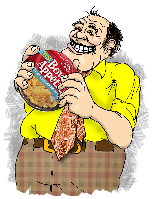
One day, one of my co-workers had his lunch resting at the top of his desk, waiting for the noon hour to roll around. His choice for his afternoon repast was a selection from the Betty Crocker “Bowl Appetit” line of microwave meals. This was a relatively new product (at the time) and several of us artists were admiring the package design. The disposable plastic bowl was slipped into a cardboard sleeve. The front of the package the side that would entice the customer when placed on a shelf was split across the middle. The top half bore the familiar “Betty Crocker” logo and the words “Bowl Appetit” in big, friendly, italic letters. The bottom half featured a full-color photo of the freshly-prepared product; glistening noodles, velvety sauce, flecks of vegetables and just the slightest suggestion of steam. The two halves of the design were bisected by a rippled block of color with the specific flavor of the meal written out in the same, friendly type as the product name. The back side of the package depicted other available flavors (Fettuccine Alfredo, Three-Cheese Rotini, some chicken something-or-other) and a small sample of each one’s packaging, all immediately identifiable as part of the same product line.
Turning the package over again to the front, we saw something that caught our attention almost simultaneously. At the top, near the “B” in “Bowl” was a large, gaudy, blue banner trimmed in yellow. Within the banner, the proclamation “Great For Lunch” was emblazoned in searchlight yellow, in a typeface not used anywhere else on the package. It was blatantly out of place and downright ugly. After some discussion, we artists theorized as to how this blemish made its way on to an otherwise well-designed, cohesive package.
We surmised that the creative packaging team at Betty Crocker were given the task to come up with an innovative design for a new product line. The group layout artists, designers, computer graphics experts all worked diligently. After several weeks and hundreds of designs, they emerged with a series of layouts and several prototypes. Each package was brilliant in its stand alone qualities as well as working as part of a series. Proudly, they made their presentation to the executive board in charge of research, development and some such bullshit. Suddenly, some out-of-touch, pencil-pushing, number-crunching dickhead stood up and questioned, “How will the consumer know you can eat this for lunch? It doesn’t say it anywhere! They may eat it for dinner or breakfast, but how will they know this would be good for lunch?” The other board members conferred, as this asshole looked at the artists and smiled smugly. Immediately, the design team was instructed to add the aforementioned, offending banner with the additional demand to “make sure it’s big”. The design team worked long hours to incorporate the new directive into their beautiful design.
And that clueless fuck went home and told his family, “I did package design today”.

I have many similar experiences in my career in advertising design.
In my stories, we artists are working for the agency that’s got the job creating collateral for the big company. We get a brief from the customer via the Account Rep and we artists & designers bust our humps getting a great concept and design with clever, engaging copy together. Everybody at the agency is ecstatic with the result, including the Account Rep.
Account Rep goes back to the client, proudly displays the design and immediately caves to the client’s bullshit whims and idiocy with nary a protest.
Back at the studio, we creative folks have to bastardize our great layouts with said bullshit whims and idiocyusually it’s stuff like “Make the logo bigger” or “Can they use a picture of my grandson I took at Christmas last year, he’s really cute. Your guys can Photoshop him using our product, can’t they?” or “I hate red and that font. Make that banner beige and the type Marker Felt. I like Marker Felt. I use it in all of my PowerPoint presentations. It’s my signature font” or “That headline is a bit strong, isn’t it? Can’t we make it a little less aggressive?” or the ever popular “I don’t like it. I don’t know how or why I don’t like it, I just don’t. Can you show me something else” or worse yet, “I like the headline from that first layout and the copy from that second layout and I want a picture of a dinosaur. Can you combine all that?”
And people wonder why advertising folks drink so much.
Well Josh, it sure is a good thing that you come home to a peaceful, pleasant, fun, and friendly home every evening. I had no idea that your average work day was so stressful and frustrating. Don’t you just draw pictures all day long?